What is the Power of Lead Magnets in Digital Marketing?
- What a lead magnet actually does
- Why lead magnets still matter
- The best lead magnets start with one clear goal
- Useful beats impressive every time
- Design matters because people judge fast
- The landing page should remove friction, not add it
- Delivery is part of the experience
- Where AI marketing fits in
- How to get more from every lead magnet
- Common lead magnet mistakes that are easy to miss
- Turning attention into connection
Most website visitors leave without doing anything you can measure. They read a page, glance at a product, maybe even like what they see, and then life gets in the way. That is normal. It is also frustrating.
A lead magnet gives you a second chance.
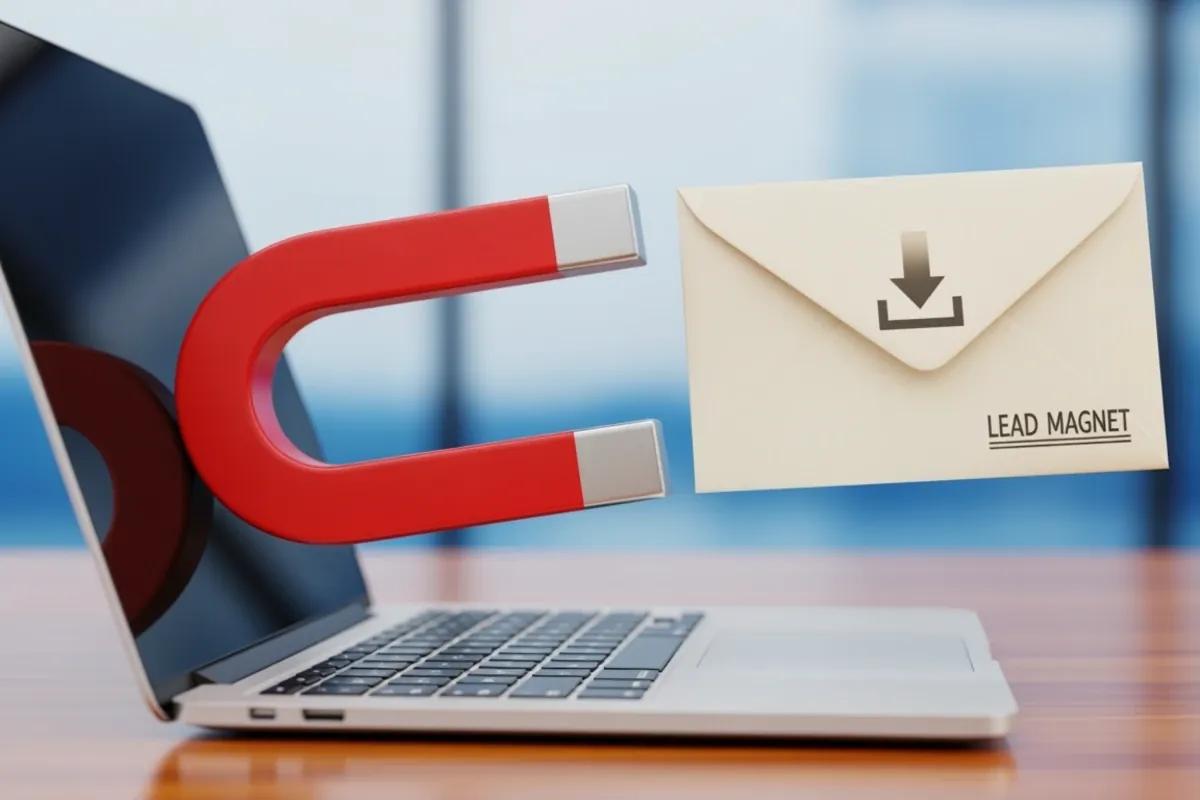
In digital marketing, a lead magnet is a useful piece of content or a practical resource offered in exchange for contact information, usually an email address. It sounds simple because it is simple. But when it is done well, it changes the whole rhythm of your marketing. Instead of hoping a stranger comes back on their own, you create a reason for them to stay connected.
For small business owners, content marketers, and ecommerce store owners, this matters more than ever. Attention is scattered. Ads are expensive. Organic traffic can be unpredictable. A good lead magnet does not solve every problem, but it does something very valuable: it turns casual interest into a real relationship you can build on.
What a lead magnet actually does
A lead magnet is not just a free download. That is where a lot of people get it wrong.
Its job is to make a fair trade. Your visitor gives you a small piece of information, and in return they get something genuinely helpful. That could be a checklist, a short guide, a template, a mini audit, a worksheet, or a quick resource that saves time or answers a pressing question.
The key word here is helpful. If the asset feels vague, recycled, or padded with filler, people notice fast. They may still download it once, but they will not trust you much after that.
A strong lead magnet works because it offers immediate value. It solves a small but real problem now, not someday. A website audit checklist, for example, helps a business owner spot weak points in minutes. A sizing guide helps an online shopper make a purchase with less hesitation. A seasonal promotion planner helps a busy marketer stop staring at a blank page.
That quick win matters. It is often the first proof that your business understands the person on the other side of the screen.
Why lead magnets still matter
Some marketers act like email capture is old news. I do not buy that. If anything, owned audiences matter more now.
Social media platforms change constantly. Search traffic rises and falls. Paid campaigns can get expensive fast. Your email list is different because it is a direct line to people who have already raised their hand and said, “Yes, I want this.”
Lead magnets help build that list with better contacts, not just more contacts. Someone who downloads a local SEO checklist, a skincare routine guide, or a product comparison sheet is telling you what they care about. That gives you context. It also gives you permission to continue the conversation in a way that feels relevant instead of random.
This is where lead magnets quietly pull a lot of weight.
They attract qualified leads because the offer itself filters people. If your free resource is specific, the people who want it are more likely to fit your audience. They also build trust because useful information lowers skepticism. You are not asking for a purchase on the first click. You are offering help first. That changes the tone.
Lead magnets can also separate you from competitors who say the same things in the same way. If every business in your category claims to be helpful, the one that actually hands over a practical resource usually feels more credible.
The best lead magnets start with one clear goal
Before you design anything, you need to know what you want the lead magnet to do.
That sounds obvious, but it is often skipped. People rush into design because it feels productive. They make a polished PDF, add nice colors, and then wonder why it does not convert. Usually the problem started earlier. The offer was not tied to a specific business goal.
Maybe you want to grow your newsletter. Maybe you want more audit requests. Maybe you want to identify people interested in a certain product category. Each of those goals calls for a different lead magnet.
If your goal is to generate service inquiries, a diagnostic tool or self-assessment can work well. If you want product interest, a buyer’s guide might make more sense. If you want top-of-funnel awareness, a short educational resource may be enough.
The strongest offers are narrow. They help with one problem, for one person, at one moment.
That is why a “complete guide to marketing success” often flops, while “10-minute homepage audit checklist for local service businesses” can do very well. One is broad and fuzzy. The other is clear and easy to imagine using.
Useful beats impressive every time
People do not download lead magnets because they admire the effort. They download them because they want a result.
So the content has to be practical.
This is especially important for small businesses, where time is tight and patience is limited. If someone opens your guide and sees five pages of general advice before they reach anything actionable, you have already lost some goodwill.
A good lead magnet gets to the point. It addresses a real pain point, speaks in plain language, and gives the reader something they can apply quickly. That may mean a checklist they can complete in ten minutes, a worksheet with prompts, or a short guide with clear examples.
I tend to think the best lead magnets are a little humble. They do not try to say everything. They solve one thing cleanly.
If your audience is early in the funnel, keep the topic accessible. If they are closer to a buying decision, you can be more specific. Someone new to your brand may want a basic explainer. Someone comparing options may want a cost calculator, feature checklist, or implementation guide.
Matching the offer to the funnel stage is not fancy strategy talk. It is common sense. A person who just discovered you usually does not want a detailed sales pitch dressed up as a resource.
Design matters because people judge fast
Even the most useful lead magnet can fall flat if it looks messy or hard to read.
This is where design tools like Canva are genuinely useful. You do not need to be a designer to make a resource that looks clean and professional. What you do need is discipline. Good design is less about decoration and more about readability.
Start with a simple structure. Use headings that tell the reader what they are about to get. Keep spacing comfortable. Choose fonts that are easy to scan. If you use colors, use them consistently. If you use images, make sure they support the content instead of filling empty space.
Brand consistency matters too. When your colors, tone, and visuals feel connected across the lead magnet, landing page, and email delivery, the whole experience feels more trustworthy. It also makes the resource more memorable.
PDF is still one of the best formats for downloadable lead magnets because it is easy to deliver and easy for users to save. Promotional graphics in PNG format can also help when you are sharing the offer on social media, in blog posts, or on landing pages.
There is a temptation to over-design these assets. I get it. Templates make it easy to keep adding elements. But clarity usually wins. A simple checklist that people actually use beats a glossy guide they close after twenty seconds.
The landing page should remove friction, not add it
A lead magnet is only as good as the experience around it.
If the landing page is cluttered, the form is too long, or the call to action is vague, conversion rates drop. Not because the offer is bad, but because the process feels annoying.
A dedicated landing page works best because it keeps the visitor focused. Instead of competing with your homepage navigation, featured services, and every other message on your site, the page can stay centered on one decision: is this resource worth getting?
The copy should answer a few simple questions quickly. What is this? Who is it for? What problem does it solve? What will I have after I download it?
You do not need a lot of text to do that. In fact, shorter is often better if the benefit is clear.
The form matters just as much. Ask for the least amount of information you need. In many cases, a first name and email address are enough. Every extra field is another chance for someone to leave.
If you are using Squarespace, this setup is fairly straightforward. You can create a dedicated landing or download page, connect a signup form, and direct submissions into the right mailing list or segment. That last part is more useful than it sounds. If someone downloads a beginner SEO checklist, they should probably receive different follow-up emails than someone who asks for a pricing guide.
Delivery is part of the experience
This is one of those details that sounds minor until it goes wrong.
If someone signs up and does not receive the resource immediately, trust drops fast. People expect instant access. They should get it.
A clean flow often includes two things. First, after form submission, the visitor is redirected to a page where they can access the download right away. Second, they receive a follow-up email with the same link so they can find it later.
That follow-up email should be simple. Remind them what they requested, give them a clear button or link to download it, and include one or two quick notes on how to use it. That last part is often missed, and it is a mistake. A small usage tip increases the chances that the person will actually open the resource and get value from it.
Automation helps here. If the email is triggered the moment a person signs up, nobody has to manually send anything, and every lead gets the same consistent experience. For a small team, that consistency is not just convenient. It prevents leads from slipping through the cracks.
Where AI marketing fits in
AI marketing tools can speed up the work around lead magnets, but they do not replace judgment.
That is the honest version.
AI can help brainstorm lead magnet topics, draft landing page copy, generate subject lines, and support content creation for follow-up emails. It can also help you test variations faster. For a small business juggling ten other priorities, that speed matters.
But the lead magnet still has to be grounded in a real audience problem. No Smart Editor or writing assistant called Craft Buddy can fix an offer that nobody actually wants. The thinking comes first. The tools help you execute.
This is true across most small business tools, really. They are useful when the strategy is clear. They become noise when the foundation is fuzzy.
So if you use AI, use it to sharpen the message, not invent value that is not there.
How to get more from every lead magnet
A lot of businesses stop at the download. That is understandable, but it leaves money on the table.
The download is the start of the relationship, not the finish line.
After someone claims a lead magnet, a short email sequence can keep the conversation moving. The best sequences feel like a continuation of the original promise. If the person downloaded a website audit checklist, the next email might explain how to fix one common homepage issue. Another email might show a before-and-after example. A later one could invite them to take the next step if they want more help.
That sequence does not need to be long. Three to five emails is often enough. What matters is relevance.
Testing also helps. Small changes can make a real difference. A clearer headline, a stronger call to action, a shorter form, or a different delivery email subject line can lift results. Sometimes the format is the issue. A checklist may outperform an ebook because it feels faster. Sometimes the problem is timing. A resource offered at the end of a blog post may convert differently than the same offer placed halfway through.
You learn by watching the data and paying attention to behavior, not by guessing what “should” work.
Common lead magnet mistakes that are easy to miss
The most common mistake is creating something you want to publish instead of something your audience wants to use.
Another one is making the topic too broad. Broad sounds generous, but it often feels vague. Specific offers usually convert better because the benefit is easier to understand.
Then there is design bloat. Too many pages, too much branding, too much filler. The asset starts to look polished but not useful. I have seen this a lot. It is a strange kind of overworking.
Poor delivery is another issue. Broken links, delayed emails, confusing redirects, or cluttered landing pages can tank performance even when the resource itself is solid.
And finally, there is the quiet mistake of not following up. If someone trusted you enough to give you their email, do not go silent or send irrelevant promotions right away. Respect the intent behind the signup.
Turning attention into connection
That is the real power of a lead magnet. It turns a passing visit into an ongoing connection.
When the offer is relevant, the design is clean, the landing page is simple, and the delivery is immediate, lead magnets do more than collect email addresses. They make your marketing feel useful. They show people you can help before asking them to buy anything.
For digital marketers, content marketers, ecommerce teams, and small business owners, that is worth a lot.
A well-made lead magnet is not flashy. It does not need to be. It just needs to solve the right problem at the right moment, then make the next step easy. When you pair thoughtful design in Canva with a smooth signup and delivery flow in Squarespace, you create a system that can capture, deliver, and nurture leads without a lot of friction.
That is why lead magnets still work. They respect attention. And online, that is rare enough to matter.

