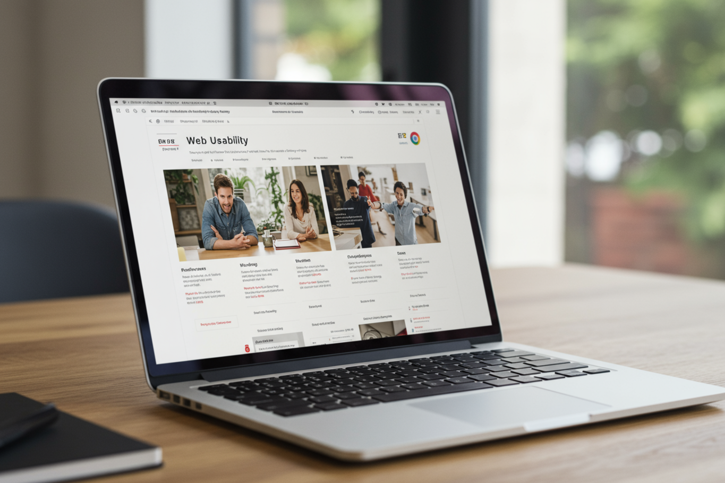
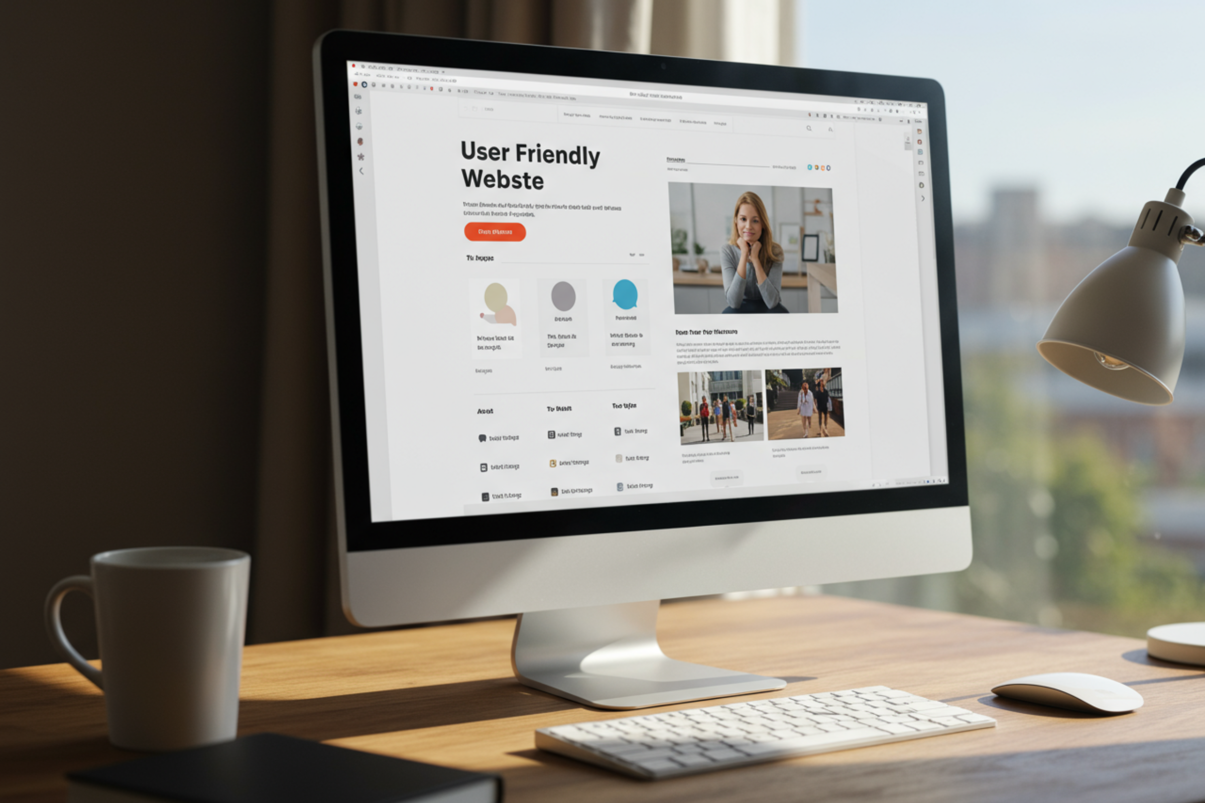
Essential Tips to Make Your Website User-Friendly: A Guide for Small Business Success
- Why User-Friendly Websites Matter for Small Businesses
- Navigating with Ease: Simplifying User Journeys
- Crafting Readable Content: Design for Scannability and Clarity
- Building Trust with Consistent Color Schemes
- Boosting Engagement Through Faster Load Times
- Maximizing Impact with White Space and Clean Design
- Bringing It All Together: Creating a Seamless User Experience
Why User-Friendly Websites Matter for Small Businesses
A user-friendly website serves as the cornerstone of a small business’s online presence. Think of your website as the digital front door to your company—often the first, and sometimes only, opportunity to make a lasting impression on potential customers. Visitors form opinions within seconds, and their willingness to engage further hinges on how easily they can navigate, understand, and interact with the site.
When usability is lacking, frustration quickly sets in. Users who struggle to locate essential information, encounter confusing menus, or face slow load times are likely to abandon the site. In fact, the majority will leave and may never return, negatively impacting your reputation and bottom line. On the other hand, a site that is intuitive, clear, and visually appealing encourages visitors to stay longer, explore more, and ultimately convert into loyal customers.
For small businesses competing in a crowded digital marketplace, prioritizing user-friendliness isn’t just a nice-to-have—it’s a necessity. It builds trust, strengthens your brand’s credibility, and provides a direct, positive communication channel with your audience. By focusing on the user experience, you set your business up for greater engagement, higher retention rates, and increased sales potential.
Navigating with Ease: Simplifying User Journeys
Navigation is the backbone of any user-friendly website. If visitors can’t find what they’re looking for quickly and effortlessly, they’re likely to leave and seek out a competitor. The key is to ensure that your site’s structure is both logical and familiar, allowing users to move seamlessly from one section to another without confusion.
Start by displaying your main navigation menu prominently, typically at the top or along the side of your homepage. Avoid hiding important links under ambiguous icons or deep within dropdown menus. Essential information—such as “home,” “about,” “services,” and “contact”—should always be visible at a glance. These standard navigation elements provide a sense of comfort and orientation, especially for users who may be less tech-savvy.
Reducing the number of sub-menus simplifies the user journey and minimizes the risk of visitors feeling lost. If your site offers a large volume of content, add a search bar in a convenient, easy-to-find location. This tool dramatically improves the user experience by enabling quick, direct access to specific topics or products.
Remember, the easier it is for visitors to find what they need, the more likely they are to stay, engage, and take desired actions—such as making a purchase or contacting your business for more information.
Crafting Readable Content: Design for Scannability and Clarity
Website visitors tend to scan pages rather than read them word-for-word. This means your content should be designed with scannability in mind to keep users from feeling overwhelmed or disengaged. Large blocks of uninterrupted text can be intimidating, causing visitors to skip valuable information or leave the site altogether.
To enhance readability, break your content into short paragraphs—ideally no more than 150 words and spanning three to eight sentences. Use clear headings and subheadings to guide readers through key topics, and incorporate bullet points or numbered lists where appropriate. This format makes it easier for users to quickly locate the information they’re seeking.
The strategic use of white space is equally important. Ample spacing between sections, paragraphs, and visual elements prevents the page from feeling cluttered and improves overall comfort for the reader’s eyes. Additionally, ensure that your text stands out against its background. Classic black text on a white background is highly effective, but if you wish to use color, opt for warm hues like yellow, peach, or orange for accents—while avoiding cool colors like blue or green for main text, as these can hinder readability.
By prioritizing clear, concise, and visually accessible content, you create a welcoming environment that encourages visitors to explore, learn, and engage with your business.

Building Trust with Consistent Color Schemes
Color is a powerful tool in shaping how visitors perceive your website and, by extension, your brand. Maintaining a single, consistent color scheme across all pages is essential for creating a cohesive and professional appearance. This uniformity not only reinforces your brand identity but also helps customers instantly recognize your business, whether they’re browsing your homepage or a product page.
Using multiple color schemes can unintentionally confuse visitors and undermine the sense of reliability you’re working to build. Inconsistent colors may give the impression of disorganization or lack of attention to detail, both of which can deter potential customers from engaging with your offerings.
Instead, select a palette that reflects your brand’s personality and values. Stick to a main color and a few complementary accent colors for buttons, links, and highlights. This approach keeps the overall look clean, uncluttered, and memorable. Additionally, make sure your color choices support accessibility by providing sufficient contrast between text, backgrounds, and interactive elements.
Ultimately, a well-chosen, consistent color scheme not only makes your website visually appealing but also cultivates trust and loyalty among your audience—an invaluable asset for any small business seeking to grow.
Boosting Engagement Through Faster Load Times
In today’s fast-paced digital world, website visitors have little patience for slow-loading pages. Research shows that users expect a site to load in two seconds or less—and if it takes much longer, they’re likely to abandon it altogether. In fact, bounce rates increase sharply after just a three-second delay, and more than a third of visitors will leave if a page hasn’t loaded within five seconds.
What’s more, the consequences of slow performance are lasting: nearly half of users who leave due to sluggish load times won’t return, and a significant percentage may turn to competitors for future purchases. For small businesses, this means that optimizing website speed isn’t just about convenience—it’s about capturing and retaining potential customers.
There are several ways to enhance your site’s performance. Start by compressing image files and using modern formats that reduce loading time without sacrificing quality. Minimize the use of heavy scripts and plugins, and leverage browser caching to help frequently visited pages load faster. Additionally, choose a reliable hosting provider and consider using a content delivery network (CDN) to distribute content more efficiently to users around the world.
By prioritizing speed, you not only improve user experience but also increase the likelihood that visitors will engage with your content, complete purchases, and recommend your business to others.

Maximizing Impact with White Space and Clean Design
White space—also known as negative space—is the area between design elements on a page. Far from being wasted space, it plays a crucial role in enhancing both the look and usability of your website. When used effectively, white space improves the readability of your content, making it easier for visitors to process information and navigate your site comfortably.
A clean, uncluttered layout draws attention to the most important sections, such as calls to action, product features, or contact forms. By spacing out text, images, and buttons, you prevent the site from feeling overwhelming or chaotic. This not only makes the browsing experience more pleasant but also guides visitors organically from one section to the next, increasing the likelihood that they’ll take desired actions.
Resist the urge to fill every available inch with content or graphics. A minimalist approach often conveys a sense of professionalism and reliability, qualities that can foster trust with your audience. In addition, a well-structured design with ample white space can make your site feel more modern and inviting—an important factor in standing out in a crowded online marketplace.
Ultimately, the thoughtful use of white space is a simple yet powerful way to elevate your website’s appearance and user experience, helping to keep visitors engaged and coming back for more.
Bringing It All Together: Creating a Seamless User Experience
Creating a user-friendly website isn’t about focusing on a single element—it’s about bringing together navigation, content readability, visual consistency, speed, and clean design to provide a seamless, enjoyable experience for every visitor. Each of these components works in tandem to build trust, support your brand, and ultimately drive business success.
To maintain this high standard, regularly test your website’s performance and usability. Conduct user testing sessions, gather feedback, and monitor analytics to pinpoint areas where visitors may be struggling or dropping off. Use this data to make informed adjustments, whether that means simplifying navigation menus, increasing page load speed, or refining your color scheme for better accessibility.
Remember that your website should evolve alongside your business and the needs of your customers. By continuously prioritizing user experience, you not only keep your current audience engaged but also attract new visitors through positive word-of-mouth and strong online reputation.
Investing in a user-friendly website is one of the most impactful steps a small business can take. By focusing on the essentials—ease of navigation, readable content, consistent colors, fast performance, and thoughtful use of white space—you create an inviting digital space that supports your goals and delights your customers at every turn.